Simulating The Letterpress: From Live Filters In Fireworks To CSS Code

Email Newsletter
Weekly tips on front-end & UX.
Trusted by 200,000+ folks.


 Flexible CMS. Headless & API 1st

One of the visual effects that is a mainstay in my Web design toolkit is the letterpress effect. Used properly, it’s a quick way to make text blend better with the layout, as if it were machine-stamped onto the background. Think of what a home appliance marquee or a professional business card looks (and feels) like, and you’ll know what I’m talking about.
Further Reading on SmashingMag:
- Sketch, Illustrator or Fireworks?
- Switching From Adobe Fireworks To Sketch: Ten Tips And Tricks
- The Present And Future Of Adobe Fireworks
- The Power of Adobe Fireworks: What Can You Achieve With It?
I’ve developed a simple workflow for creating a letterpress text effect in Adobe Fireworks that, with the advent of CSS3, can be applied directly to HTML text — no images needed. Here’s the best part: it doesn’t use any Bevel or Emboss Live Filters.

What Is Letterpress?
Letterpress is a venerable technique of printing that involves “pressing” a plate of movable type onto a sheet of paper to produce an effect that is impressed (where the text is pressed down onto the paper) or embossed (where the text is raised above the surface of the paper).

An example of a letterpress business card with impressed text. (Image: Audimas Adomavicious)
The classic charm of letterpress found its place in digital design once designers were able to emulate its effect on screen. To accomplish that, designers observed the effect of light and shadow on the dents on paper that had gone through the printing process. Imagine a light shining down at an angle on a sheet of letterpress text. Impressed text will appear to have a sliver of highlighting at the bottom edge of the letters and a thin shadow at the top edge. Embossed text is just the opposite: highlights on top, shadows on the bottom. These properties create the effect of raised or sunken areas along the surface, and this can be translated using effects made possible by both Fireworks and the CSS3 specification.
Why Not Just Use Bevel or Emboss?
Fireworks’ Bevel and Emboss Live Filters are a bit primitive for my tastes. The refinement controls are unwieldy — for example, you can’t set highlights and shadows independently — and the result is subpar. It works OK for straight edges and sharp corners, but it gets rough around curves. I suspect this is because the effect is raster-based, so that it can work with any object (shape, text or embedded image); a vector-based tool would have allowed for a smoother and more precise effect.

The letterpress effect using the Outer Bevel Live Filter. Notice the roughness of the curved edges.
Letterpress Text In Fireworks
A better way to recreate the effect would be to use the Drop Shadow Live Filter, because it produces smoother edges. This solution hinges on a basic setting: a shadow and a highlight, offset exactly 1 pixel up or down, relative to the text object. For this tutorial, we’ll start with two text objects of different colors, set against a colored background.

Start with two text objects.
Embossed Text
To create an embossed effect, apply two Drop Shadow Live Filters to our first text object:
- Apply a “Shadow” (distance: 1; color: #000000; opacity: 60%; blur: 0; angle: 270;) to the bottom of the text, and
- Apply a “Highlight” (distance: 1; color: #FFFFFF; opacity: 90%; blur: 0; angle: 90;) to the top of the text.

Embossed effect applied to the “Smashing” text object.
The opacity of the Drop Shadow filters will depend on how light or dark the background is in relation to the text’s color. Tweak these values according to how pronounced you want the letterpress effect to be.

Adjust the opacity value in the Drop Shadow Live Filter.
Impressed Text
To create an impressed effect for the second text object, just switch the angle values of the “Shadow” and “Highlight” Drop Shadow filters shown in the previous step, so that the shadow is on top of the text and the highlight is on the bottom. Adjust the opacity values to maintain contrast against the darker text object’s color.

Impressed effect applied to the “Magazine” text object.
Note: These effects work best with text and background color combinations that aren’t black and white, as in our example. If you’re working with black text or black backgrounds, you’ll want to skip the “Shadow” effect, because it will do little for the text. Similarly, for white text or white backgrounds, forego the “Highlight” effect.
Save as Style for Reuse
Now that our letterpress effects are in place, we can save them as Fireworks Styles so that we can use them again later without having to apply each filter manually.
To create a Fireworks Style:
- Select the “Smashing” text object with the Pointer tool (V);
- Bring up the Styles panel (Control/Command + F11, or in the menu Window → Styles);
- Click on the context-menu icon in the top-right corner of the panel, and click on “New Style”;
- In the “New Style” dialog box, let’s give our style a descriptive name, like “Letterpress Emboss.” Uncheck all properties except for “Effect,” and click OK.
- Repeat steps 1 to 4 for the “Magazine” text object.

Styles panel and context menu

“New Style” dialog box
You should now see two new items in your Styles panel. The next time you want to apply the emboss or impress effect to a text object, just select that object, and click on the new style that you created.

Styles panel with two new styles
Additionally, you can save these new styles as a Style Library file (*.stl), to share with other designers or to back up your styles before reinstalling Fireworks.
To save a set of styles as a Style Library file:
- Bring up the Styles panel (Control/Command + F11, or Window → Styles);
- Click on the context-menu icon in the top-right corner of the panel, and click “Save Style Library”;
- In the “Save As” dialog box, enter a descriptive file name for the STL file, and then click “Save.”

The Styles panel, again.

“Save As” dialog box
To import a previously saved Style Library:
- Bring up the Styles panel (Control/Command + F11, or Window → Styles);
- Click on the context-menu icon in the top-right corner of the panel, and click “Import Style Library”;
- In the “Open” dialog box, browse to and select the STL file, and then click “Open.”
Hint: Need a good library of Letterpress Styles for Adobe Fireworks? Why not check this 16 Letterpress Styles set by Mikko Vartio?
Translating Into CSS
Option 1: Translate the Values of the Live Filters Manually
Aside from the downsides of the Bevel and Emboss filters that I mentioned earlier, the other reason I use Drop Shadow filters is that they readily translate into CSS3’s text-shadow property. Consider this basic syntax:
text-shadow: [x-offset] [y-offset] [blur] [color-alpha];Let’s break this down:
[x-offset]is set to0, and[y-offset]is either1pxor-1px, depending on whether the shadow or highlight is at the top (90°) or bottom (270°);[blur]is set to0, to keep the shadow and highlight effects crisp;[color-alpha]is set using an RGBa value:rgba(r, g, b, a).- The first three values (
r,gandb) correspond to the decimal red-green-blue values of the color itself (for example,#FFFFFFin hexadecimal is equal to255, 255, 255in decimal); - The last value (
a) determines the transparency of the color (where0is completely transparent,0.5is half-transparent, and1is completely opaque).
- The first three values (
Let’s apply our effects to the following HTML markup:
<div class="embossed">Smashing</div>
<div class="impressed">Magazine</div>
Our CSS for the embossed effect would be:
div.embossed {
   text-shadow:
      0 1px 0 rgba(0, 0, 0, 0.8), /* shadow */
      0 -1px 0 rgba(255, 255, 255, 1.0); /* highlight */ }
And for the impressed effect:
div.impressed {
   text-shadow:
      0 -1px 0 rgba(0, 0, 0, 0.8), /* shadow */
      0 1px 0 rgba(255, 255, 255, 0.5); /* highlight */ }
Here, I have slightly adjusted the opacity values in the text-shadow property (relative to the original values in the Drop Shadow Live Filter in Fireworks) to better suit the way fonts are rendered in the browser.
.")
Screenshot of the HTML and CSS output in Mozilla Firefox. See an HTML sample.
.")
Screenshot of the HTML and CSS output in Apple Safari. See an HTML sample.
Option 2: Use the CSS Properties Panel in Fireworks CS6
Writing CSS code by hand is what we Web professionals usually do. But in some cases, tools can help us, too.
Fireworks CS6 (which was recently released) has a new feature that could help you when you want to quickly (yet reliably) translate the properties of a visual element in the design to CSS3 code. The CSS Properties panel can extract CSS3 code for virtually any object selected on the canvas, including text objects and live filters.
Let’s see how this could help us in practice when working with the letterpress effect!
If you have a copy of Fireworks CS6 (a trial version would do, too), open the letterpress-effect.fw.png file provided with this tutorial (see the Downloads section further below), and then with the Selection tool, select the first text object.

Open the letterpress-effect.fw.png file, and select the first text object.
Next, open the CSS Properties panel (in the menu, Window → CSS Properties, or Control/Command + F7), and while the first text object is selected, notice how the CSS panel instantly shows the object’s properties.
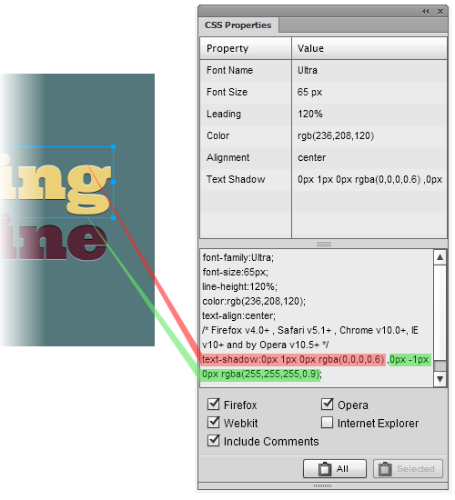
The CSS Properties panel shows the properties of the selected text object as CSS code. Highlighted here is the code that translates the two Live Filters into CSS.
In this case, we’re interested only in the Live Filters applied to the text object, so let’s copy this bit of code from the CSS panel and see how it looks:
text-shadow: 0 1px 0 rgba(0,0,0,0.6), 0 -1px 0 rgba(255,255,255,0.9);As you see, we’ve got results similar to what we achieved earlier with the manual method. Fireworks CS6 has automatically translated the Live Filters that were applied to the “embossed” text object into clean and valid CSS!
Similarly, you can extract and copy the CSS for the Live Filters applied to the “impressed” text effect.
And if you strive for perfection (as many of us do), along with the CSS Properties panel, you can use CSS Professionalzr, an excellent free extension by Matt Stow that can further optimize the code produced by the CSS Properties panel.
Of course, even if you’ve already switched to Fireworks CS6, you can always opt to translate the properties of Live Filters to CSS code manually. But when you’re dealing with a lot of objects, the CSS Properties panel comes in really handy and can save you precious time.
Tips on Using the Letterpress Effect
- Use the effects sparingly. Text effects are the last thing you want to abuse, because they could impair readability, especially for people with vision problems. Restrict them to headings and interactive items (such as buttons and menu links).
- Enable them to degrade gracefully. While most modern browsers already support CSS3 to some extent (see the note below), Internet Explorer 9 still doesn’t recognize the
text-shadowproperty. In an effort to make things look consistent, you might want to look for a workaround, but I highly recommend that you gracefully degrade the effect in browsers that don’t support the property. Effects should be enhancements, not vital features.
Please note: Browsers that fully support the text-shadow property (with multiple shadows) include Firefox 3.5+, Chrome 4+, Safari 4+ and Opera 9.5. As of version 9, Internet Explorer still does not support the official text-shadow definition; instead, it has a proprietary filter that achieves a similar effect.
Examples
Here are a few real-world examples of the letterpress effect in action.
Veerle’s Blog The letterpress effect — applied to the (image-rendered) logotype and headings — creates a bit of contrast against the background here, while still keeping everything subtle. Notice the use of both embossed and impressed effects in the column headings.

Stunning CSS3 (teaser page)
Coupled with @font-face declarations for custom HTML fonts, the letterpress effect on the different heading levels makes for a sophisticated look, previously feasible only with image-based text. (Note that the teaser page we’ve linked to here is an archived version.)

Janko at Warp Speed
The use of only one text-shadow effect, and only on the headings, exemplifies Janko’s restraint in order to maintain contrast and readability. Also notice the 45° offset in the highlight effect, which you can achieve in CSS by adding a 1-pixel x-offset to the text-shadow.

Downloads
- Need a sample to study? Download the archive for this tutorial (ZIP, 84.5 KB), which includes the Fireworks PNG (created in Adobe Fireworks CS5) and the HTML sample.
- The Fireworks PNG uses the awesome (and free) Ultra font.
- You can also download the Style Library separately (ZIP, 22.3 KB), created in Adobe Fireworks CS5.
The samples (i.e. the Fireworks PNG and Style Library) should work fine in any recent version of Fireworks (CS4, CS5, CS5.1, CS6).
Further Reading
- Blueprints For The Web: Specctr Adobe Fireworks Plugin
- Refining Your Design In Adobe Fireworks
- Useful Typography Tips For Adobe Illustrator
(al) (mb)


